Singapore's Marathon: Who Runs the Race?
By Jasmine Siswandjo in data
May 20, 2025

42 Kilometres in 30 Degrees: Who Even Runs In Singapore?
As a goal-driven 20-something in Singapore, I’ve definitely entered that phase where everyone is thinking about getting into running — Park Runs, Lululemon community jogs, and of course, the big one: the Standard Chartered Singapore Marathon.
I’m here for it. It’s great for cardiovascular health, discipline, and maybe a bit of the “hybrid athlete” trend. But there’s one thing I keep wondering every time I run outside:
Who can run for hours in this heat?
And how does Singapore’s marathon stack up to others around the world?
After all, we’re dealing with daily averages of 30°C, high humidity, and climate change only turning the dial up. 2024 was officially Singapore’s warmest year on record — and 2025 already feels hotter.
I came across a reel calling the Singapore Marathon one of the worst races for fast times. If you want a PB, head somewhere cool, flat, and dry. The climate here slows everyone down.
But what makes this race interesting isn’t just the elites. It’s the mix: locals, expats, tourists — all dragging themselves across 42.195 km of road.
So I pulled the data and here’s what I found.
Who’s Running, and How Fast?
I gathered finisher data from the Singapore Marathon 2024 results and did a little poking around with the race numbers, times, and nationalities. If you want to take a look yourself, I’ve shared the Google Sheet here.
Bib numbers reveal a lot
Runners with bibs numbered under 1000 are typically invited elite athletes. Their times ranged from 2 to 3 hours, which is… very fast.
- The top 9 male finishers all had bibs between 1 and 17
- That 10th finisher was Shunsuke Matsui whom the internet has nicknamed “Japan’s fastest amateur runner!”
| Type | Mean Time | Median Time | SD |
|---|---|---|---|
| all | 05:35:58 | 05:37:16 | 01:06:50 |
| elite male | 02:52:38 | 02:55:20 | 00:21:46 |
| elite female | 02:59:25 | 02:48:34 | 00:21:15 |
| amateur | 05:37:00 | 05:37:55 | 01:05:46 |
| male | 05:33:31 | 05:34:29 | 01:06:52 |
| female | 05:47:17 | 05:48:17 | 01:05:28 |
From this, we can see:
- Elites finish far faster with a mean time of 2:52 for males and 2:59 for females, and much smaller standard deviations
- Men are slightly faster on average, but not dramatically so
- The spread is surprisingly wide for amateur runners (a standard deviation of 1 hour 5 minutes)
A Quick Note on Standard Deviation
Let’s talk about that last column — the SD, or standard deviation. Its’ a measure of how spread out the runners’ finish times are.
If the mean time tells you where most people cluster, the standard deviation tells you how tightly or loosely they’re grouped around that average.
-
A small SD means most people finished close to the average time.
-
A larger SD means there’s a wider spread, some were much faster and others much slower.
If your time falls within one standard deviation of the mean, you’re in the middle ~68% of finishers, or part of the majority pack.
For example: Here the average amateur time was 5h 37m with an SD of 1h 5m, then finishing between 4h 32m and 6h 42m puts you within 1 SD of the average, statistically, that’s the “mainstream marathoner in Singapore on this day.”
For elites, you can see their SD was just around 20 minutes. That means that they cluster closely around the mean. They’re not just fast, but consistently fast.
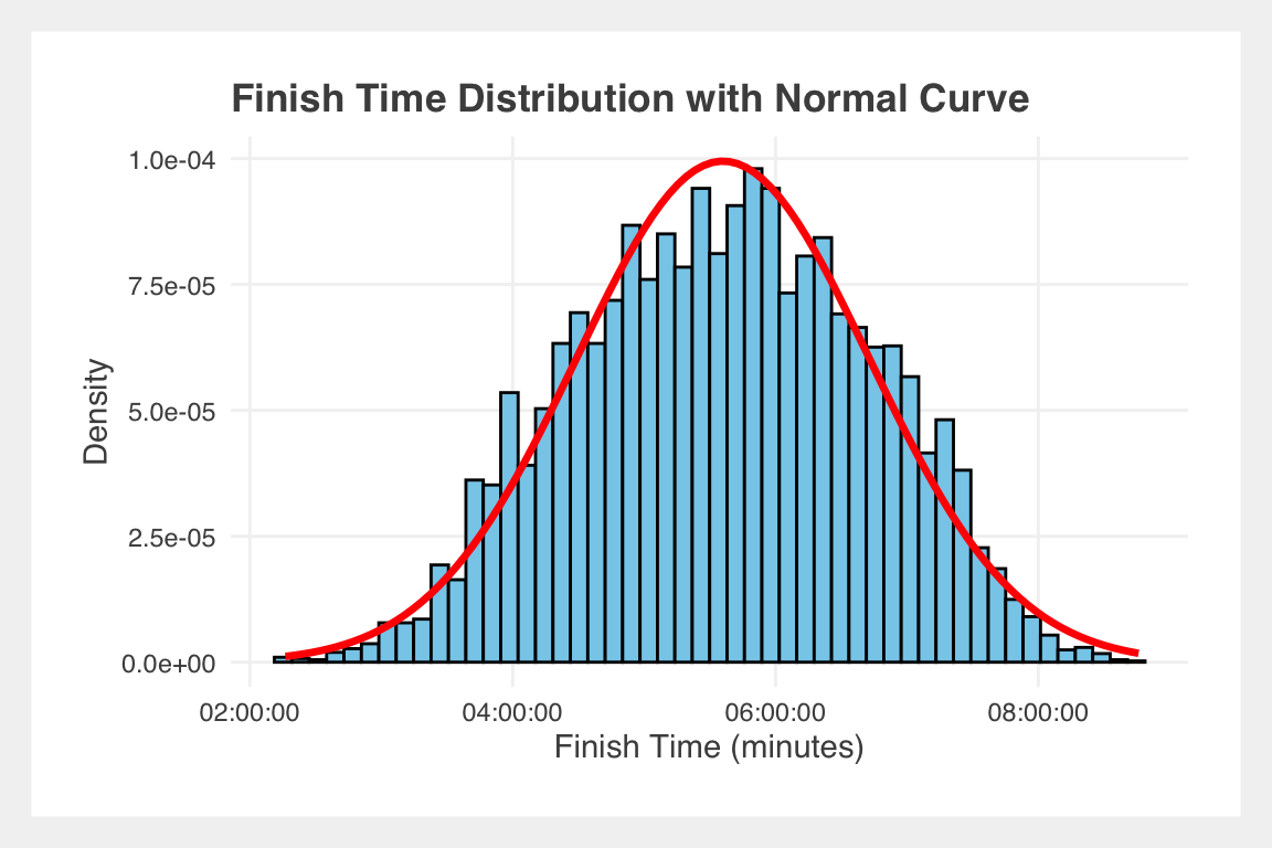
Normal Curves in the Wild
Plotting the finish times across the full dataset gives us something beautiful — a classic normal distribution.
Just a fun little normal curve popping out in the wild! No wonder we study them.
So where do the runners come from?
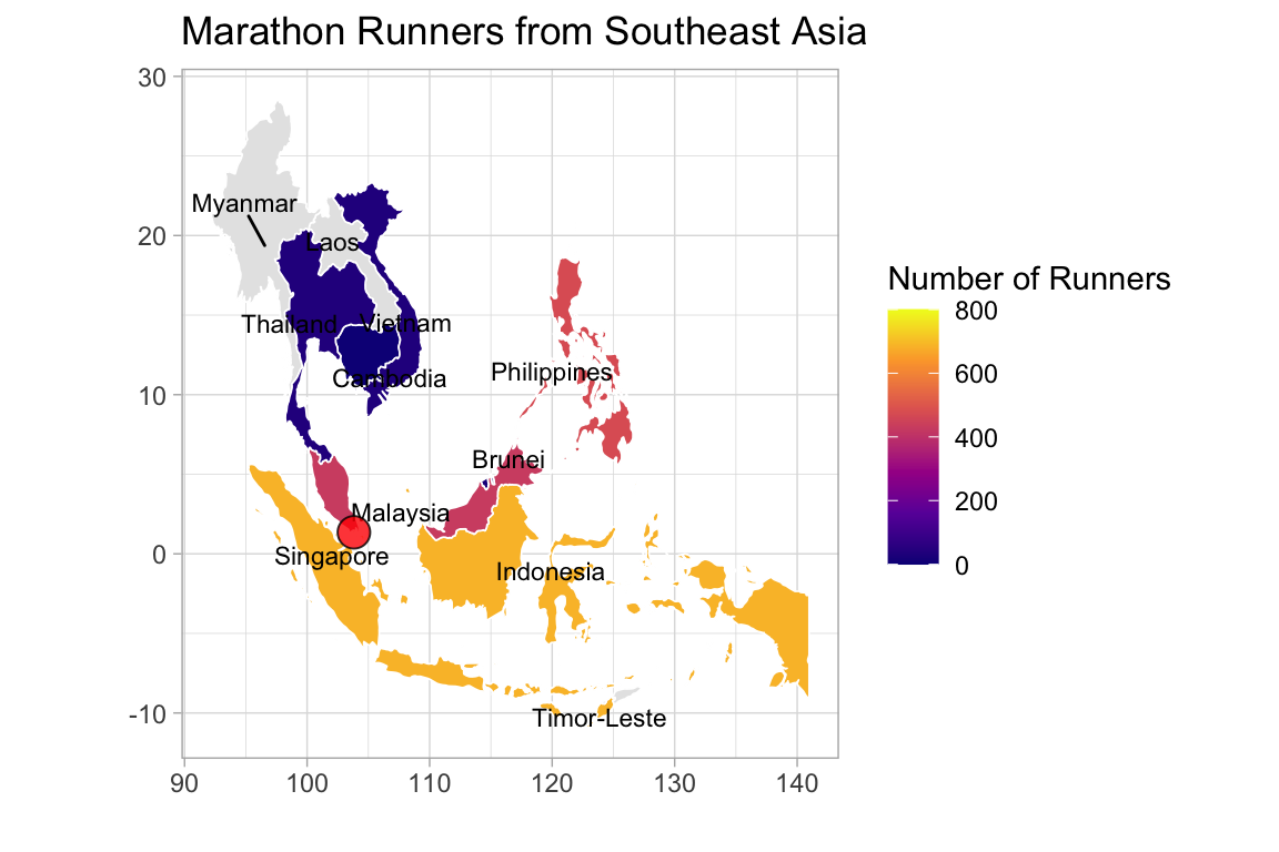
A total of 74 countries were represented in the marathon. But the dominance of one nation was overwhelming: 🇸🇬 Singapore, with 4,928 runners.
Next in line:
- 🇮🇩 Indonesia: 684
- 🇨🇳 China: 473
- 🇵🇭 Philippines: 472
Here I learnt something new about geography, yet again. There’s a difference between ISO codes (used in data) and IOC codes (used in sports and by the International Olympic Committee).
Singapore is SGP in ISO and SIN in IOC. It’s actually quite nice, because they’re more human-readable, often based on local or historical naming, like MAS for Malaysia instead of MYS. Fortunately, there was a
handy csv file floating around with both IOC and ISO codes.
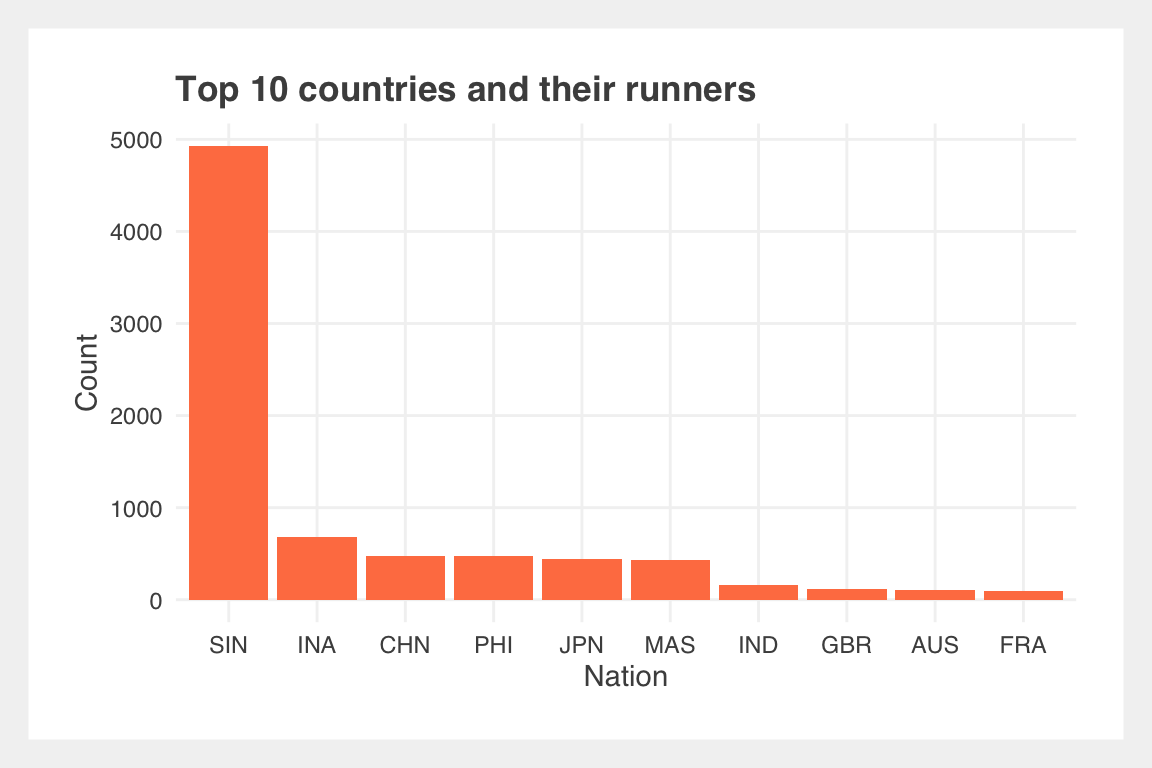
That’s a steep drop in numbers, and it creates a common data visualization problem.
The Visualization Problem: When One Country Dominates
When one value is too large, it distorts the scale and hides the rest of the story.
Can you even see where the highest number of runners come from?
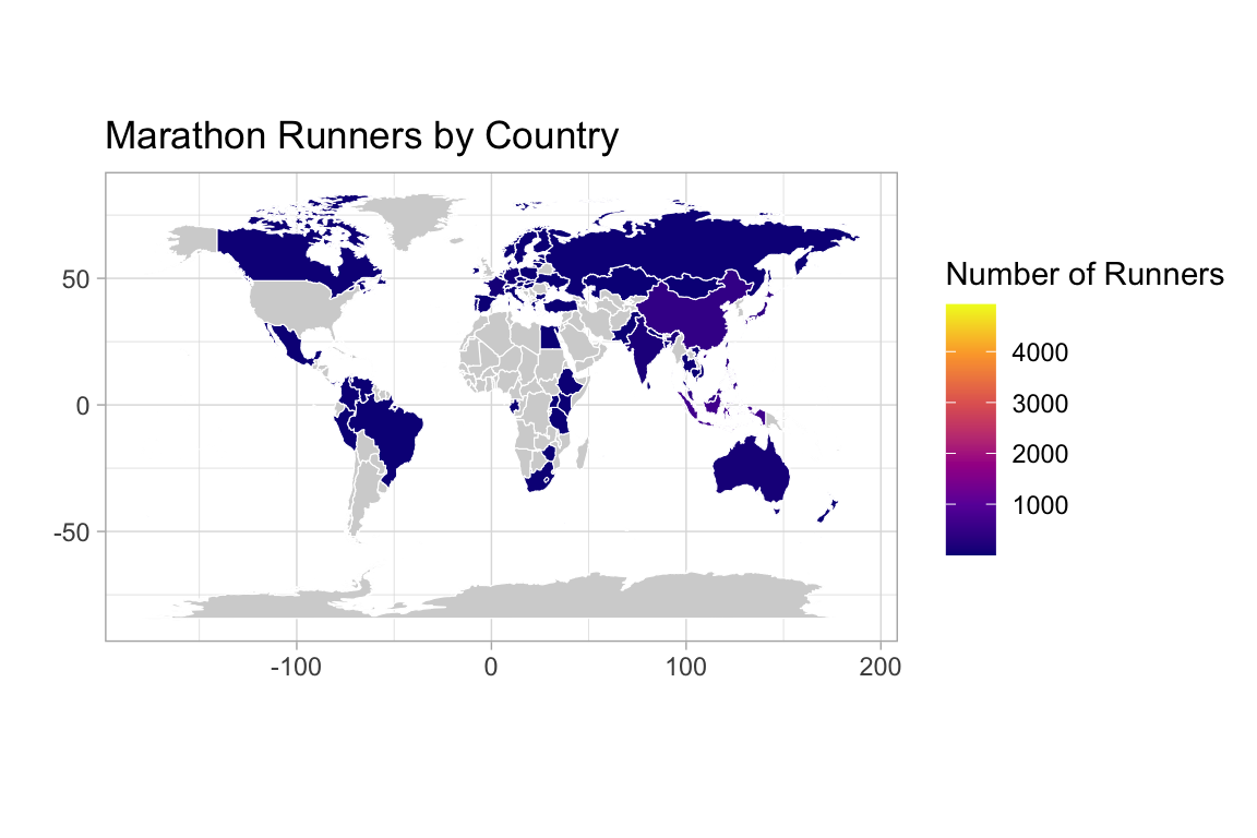
Nope, you can’t even see Singapore on this map!
How about now, after zooming into Asia?
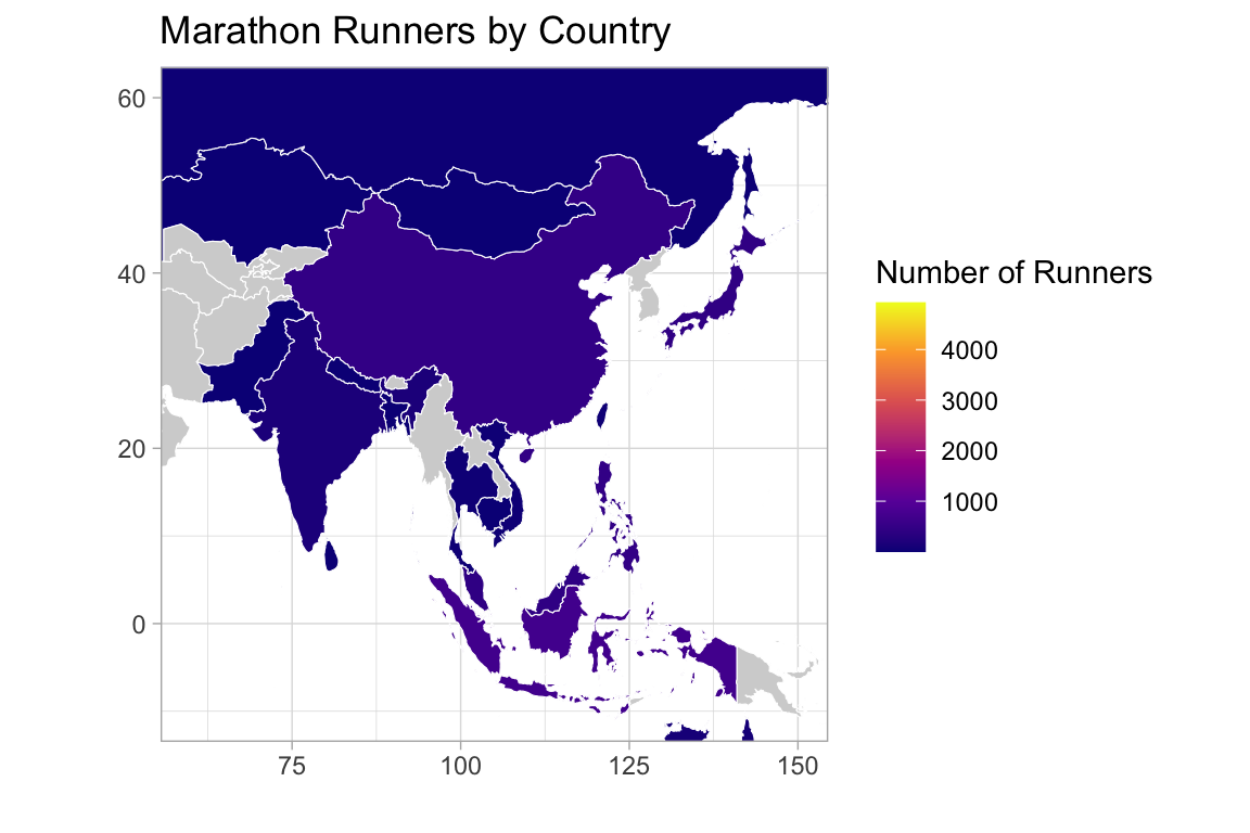
Even after zooming in, Singapore isn’t visible, and because the number of Singaporean runners is so disproportionately high, the color scale gets thrown off, with countries like Indonesia and Japan fading into the same shade of “not-Singapore”.
Fixing the Scale Without Losing the Story
When you’re working with heavy skews like this, there are two options:
- Log-transform the scale
- Clip the max value (e.g. treat everything above 800 as “maxed out” for color)
Both preserve insight, but the first is more scientific while the second is more intuitive.
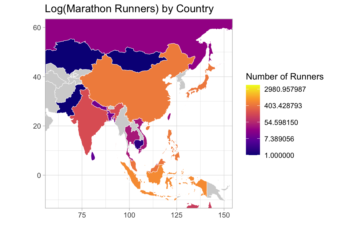
The plot looks nicer, with more colors, but humans just don’t intuitively think on the log scale. Does anyone even remember what Log(1) is? It’s 0! (I had to look it up)
*Another fun fact I didn’t know until I went to graduate school is that statisticians use log and ln interchangeably to mean ln, which is the natural logarithm. So in this case is it log or ln? It is ln, since there are options for
“log” and “log10” when supplying the argument for transform.
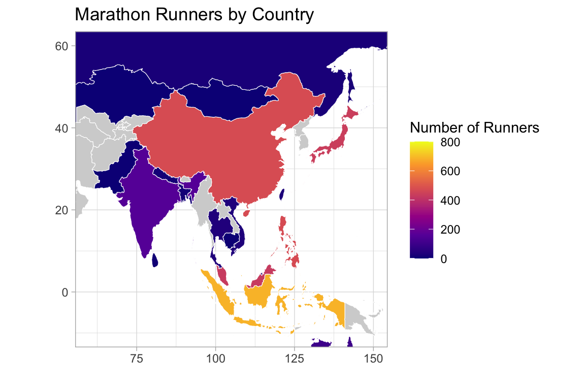
Since the number of runners is something we can intuitively grasp, the better choice here is to just go with a clipped scale. As for Singapore, it’s not gonna be visible regardless, so let’s just put a big red dot, which Singapore itself has already embraced long ago with its iconic nickname: the “little red dot”.
So… Would I Run It?
For a race that’s hot, humid, and far from easy, it’s striking how many people still show up: locals, expats, and tourists alike, just to run through the streets of this little red dot. I doubt I will run the Singapore Marathon any time soon, but this gave me a fun little insight to know who is running, and where they come from!
- Posted on:
- May 20, 2025
- Length:
- 6 minute read, 1076 words
- Categories:
- data
- See Also:
- Singapore: The world's sixth 'Blue Zone'